
We’re going back to our roots! Today, we are happy to share our new logos and colors for both Bruno’s Restaurant and Tavern and Bruno’s Pasta Company.
We worked with Anania Media to not only produce the new logos, but also a fresh set of commercials for TV and connected devices, brand new packaging for Bruno’s Pasta Company products, and as you probably have noticed, a refreshed website design.
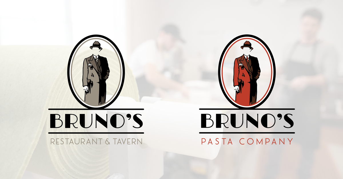
Anania Media partnered with designer Scott Whitehouse to develop the two new logos. The new designs honor the brand’s history as a long-time Portland, Maine establishment by including similar fonts and colors from the early days of Bruno’s Restaurant and Tavern. On the retail pasta side, long-time restaurant-goers will recognize some of the same elements that they are familiar with, but red is utilized as a primary color as a way to differentiate the two different brands.
Building off of last year’s advertising campaign, five new television ads have been produced, including the first-ever ads specifically for Bruno’s Pasta Company. The Bruno’s website has been updated with the new logos and colors, and new packaging for Bruno’s Pasta Company products will be on the shelves in the coming weeks. To find out where you can buy our homestyle, traditional Italian pasta, visit BrunosPastaCompany.com for a list of retail locations.
So the look may have changed, but the hearty dishes and friendly atmosphere that you know and love certainly have not. We hope you enjoy our refreshed look as much as we do. And keep an eye out on TV and online for our new ads!
Leave a Reply